

「关茶」是一个抹茶品类相关的零食品牌,致力于挖掘寻找抹茶多样的可能性.与其他的抹茶相关品牌较为传统的定位不同,「关茶」的品牌形象时尚现代且具有很强的亲和力.在本次的设计中,以“ 一片木的空间”为设计概念,希望通过极简的空间语言将品牌中的“多样性”“治愈感”等属性更为直观的传达给每个进入到这个空间里的人,创造出独特的空间体验.
Nazodesign is commissioned by the popular snack brand ‘Matchall’, being responsible for the store design located in Dawanglu,Beijing.
Matchall is a matcha-related snack brand, dedicated to exploring the possibility of diverse matcha. Different from traditional orientation of other matcha related brands, the brand image of Matchall is very fashionable and modern with strong affinity. In this project, Nazodesign is based on the concept of “Space Made from One Wood ”. It is hoped that the attributes of "diversity" and "healing" in the brand will be conveyed more intuitively to everyone entering this space through the language of space to create a unique spatial experience.

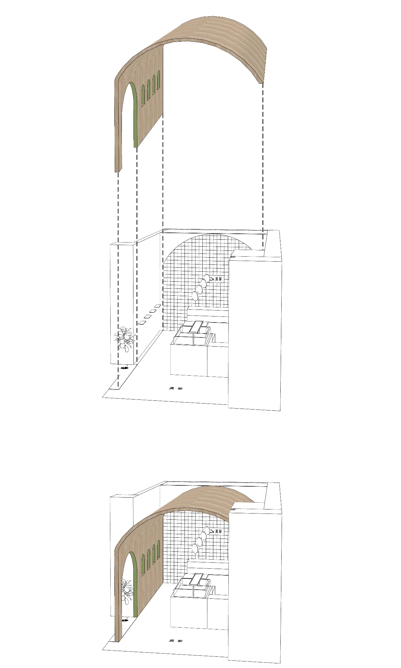
▲轴测图


店面形状是一个较为规则的长方形,空间需要整合收银、冷品操作、冷藏展示、产品展示陈列、产品试吃、产品常温收纳、产品冷藏收纳等功能.我们首先对于功能进行了梳理,将收银、冷品操作、产品试吃等需要店员与顾客频繁互动的功能区块合为“动区”,将产品展示陈列、产品常温收纳、产品冷藏收纳等不需要互动的功能区块合为“静区”.“动“”静“两区在空间两端分别均匀排开,设备高度、宽度进行统一设计,最大程度的保证了空间的秩序感和清洁感.
In this rectangular space, we needs to integrate the functions of cash register, cold operation, refrigerated display, product display, product trial eating, product storage at room temperature, product refrigerated, etc. We firstly combed the functionality. Functional blocks, such as cash register, cold operation, product trial eating, require frequent interaction between shop assistants and customers are combined into “dynamic zone”. Functional blocks, such as product display, product storage at room temperature, and product refrigerated, that do not require interaction are grouped into “static zone”. The " dynamic " and "static" zone are arranged evenly at both ends of the space. The height and width of the equipment are unified to ensure the sense of order and cleanliness in most extent.

品牌logo中的"相遇"图形我们稍做简化处理成弧形,作为店面的主要空间视觉符号.我们将木质的弧形造型由墙面进一步延展至天花成为顶,从而围合出一个完整的空间.从整体上看,像是由一片木头经过弯曲演变为一个空间.连贯一致的弧形造型很好的柔化了空间的氛围,并带来心理上的安全感和舒适感.
As the main space visual symbol of the store, we extract the curve from logo and extend the wooden curve to the ceiling as roof,so as to make a complete space.On the whole, it looks like a piece of wood evolves into a space after bending. The consistent arc shape also softens the atmosphere of the space in perfect visual. It also brings psychological safety and comfort.


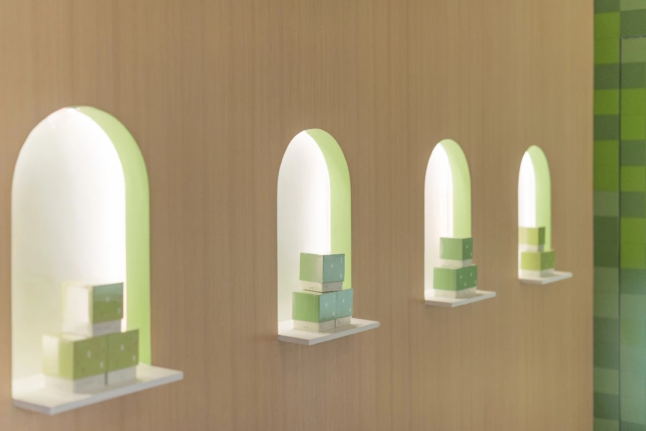
我们在木质造型上设计了四个弧形的展示龛,丰富了客人从“动区“走至”静区“的路径体验
We have designed four curved display area on the wooden curve to enrich the visitors' experience of walking from “dynamic zone” to “static zone”.

产品陈列的台子使用硬质亚克力灯箱作为展示面,柔和均质的光线能突显产品外观的精致,并使面积较小的“静区”更为私密温馨.
Hard acrylic lamp box is used as the display surface on the display platform. Soft and homogeneous light can highlight the exquisite appearance of the product and make the small "static zone" more private and warm.

我们提取了品牌色中的抹茶绿作为空间主要色系,并搭配白色营造简约现代的空间氛围.并将3种不同色阶的"抹茶绿",通过平面排版,打造了一面极具视觉特色的“抹茶生巧块”墙,不同的绿色也象征着不同浓度的抹茶具有不同的多样属性.
We extracted the green from the brand color as spatial main chromatic system and combined with white to create a simple and modern space atmosphere. And “matcha green” with three different color scale, through the plane typesetting, created a very visual characteristic “matcha green block" wall. Different green also symbolizes that different concentration of matcha has different properties.


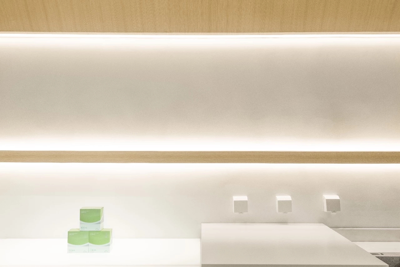
墙上的实木条展示架背面藏有线性光源,辅助产品照明的同时,也可以丰富空间的照明氛围.
A linear light source on the back of the solid wood rack on the wall can also enrich the atmosphere of the space with lightening assistance.

家具的台面和立面使用金属烤漆版,并以不同的颜色进行对拼.
The tables and facades of the furniture are decorated with metal lacquer plate and split jointed in different colors.

▲平面图 / floor plan
项目信息
项目:关茶大望路店
项目团队成员:田少寅,曾煜娴,郭益克,黄凯峰
面积:28平方米
完工时间:2018年8月
照片拍摄:王屴
Zhong
全部评论